How can we make confusing text about important childhood registration schedules understandable at a glance?
This was a project within the larger redesign of a website which I worked on with the district’s technology and communications team and our in-house designers and developers. I was the sole designer and developer of this element. This case study focuses on the design of an interactive visual timeline graph to improve clarity and comprehension for parents of young children.
The Problem
New parents have a lot of unfamiliar responsibilities and expectations to handle. In the United States, parents are required by law to sign their children up for school. To make that happen, there are a few more things they need to sign up for or finish before their child reaches specific ages.
As a new parent myself at the time, I felt confused by the choices and rules for early education. The information was given in big, siloed paragraphs of text that sometimes seemed to say different things.
For instance, the website had this text and more scattered among several different pages:
“Early Childhood Screening… can be completed any time after age 3 and prior to starting a public school. The ideal time for screening is between ages 3 and 4."
Another page said this:
"Your child can enroll in kindergarten when: They are 5 years old by September 1 and they have completed early childhood screening."
And other pages had more information:
"Early Intervention Services (EIS)... provides special education services... to children... ages birth to age of school entry."
"Early Childhood Family Education (ECFE) is a program... to offer learning experiences for... children from birth to Kindergarten entry."
"Jump Start Preschool... offers age-appropriate activities, curriculum and assessment for 3, 4, and 5-year-old children..."
"Keys to Kindergarten... is open to children... who will be starting kindergarten in the fall.”
In a school district with people from different cultures, it’s important to make information easy to understand for those who don’t speak English as their first language. But even for a native speaker like me, I found myself asking several questions as I clicked through multiple pages on the site:
- How many programs or screenings are there and how are they different from each other?
- Which are required and which are optional?
- There are several age-group overlaps, so when can and should I schedule the ones I need to complete?
Exploration & Research
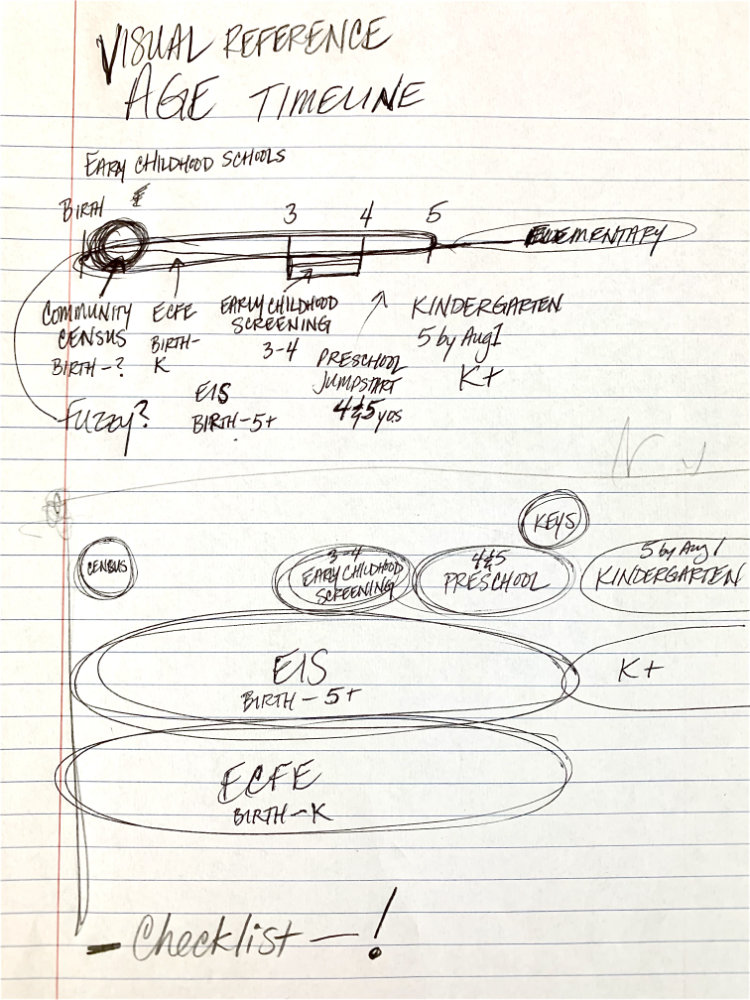
First, I collected details about early childhood screenings, programs, and enrollment. I organized them by suggested age – from Birth to 6 years old.
Then I began sketching simple timeline drafts. In the initial sketch, I started by overlapping the sections. But I quickly discarded that design and broke each section out into multiple rows to have more space for the text.
Also, since there was enough information about each program to warrant its own webpage, I aimed to come up with a method to include links to each page right on the timeline itself. These links would allow users easy navigation to those specific pages.
What We Shipped
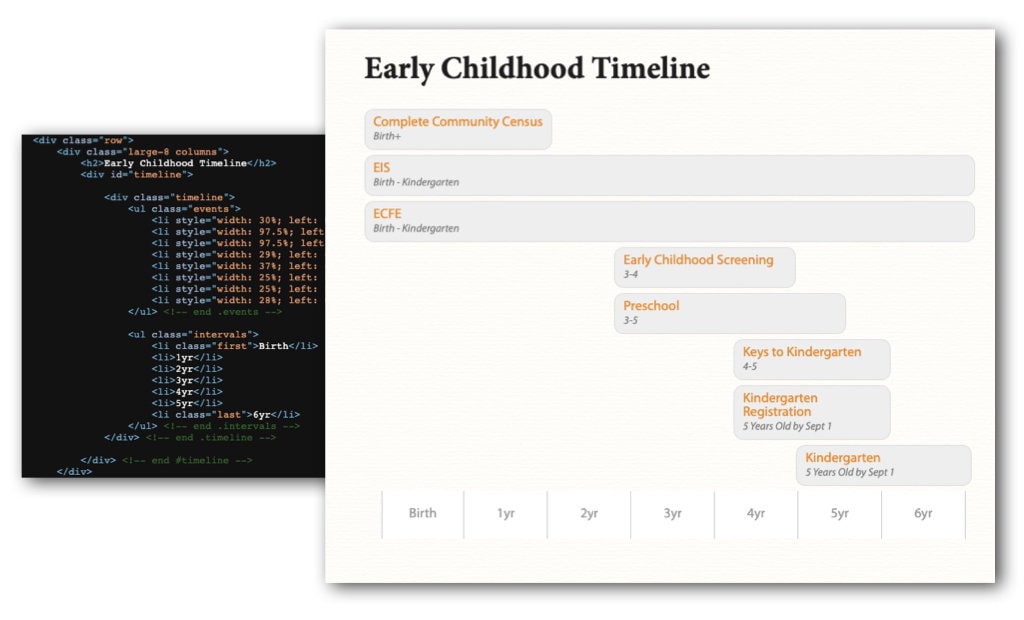
I created a user-friendly timeline for the website that shows parents when to schedule early childhood tests and program enrollments. I used the district’s branding for the colors, typography, and visual style. Instead of a static image, I built the graph with HTML and CSS to include links to other web pages with more details and re-scale it responsively across mobile, tablet, and desktop screen sizes.
Looking back on this project, one element I didn’t introduce but would be worth exploring would be to use color-cues or other design elements to indicate which were required and which were optional. For example, Minnesota law requires Early Childhood Screening before a child can enter kindergarten, but Preschool is an optional program.
Despite this, the timeline was an immediate upgrade. It made important information clear to the public and provided an easy way for people to explore details about each test or program using visual navigation.
Response
The Early Childhood Timeline was well received by the school district’s technology and communications team. They gave it prominent placement on the main early childhood page of the website when the redesign launched, where it stayed through the next redesign.
Also, the website redesign project as a whole was recognized with a MinnSPRA Star Award for Electronic Media, acknowledging the exceptional quality and success of the final product. Judges noted the consistent appearance, ease of navigation, responsive design, and use of bright graphics.