How may we enhance the overall user experience for everyone?
Throughout my career journey, I’ve collaborated with numerous organizations, businesses, and professionals committed to social responsibility and equal opportunities for both employees and customers. I’ve consistently advocated for creating an inclusive and accessible online experience for all users, and I’ve acquired web design and development skills that support these goals.
Text Readability
Ensuring that text remains legible and can be resized without affecting content or functionality is crucial. According to the World Health Organization (WHO), around 30% of the global population, or 2.2 billion people worldwide, experience some form of vision impairment or are blind.
To maintain readability on websites and in HTML emails, I have:
- Implemented interactive text-sizing features on websites and used relative units in styles and CSS (e.g., percentages and ems) to allow for easy text resizing.
- Selected font-families native to browsers and email programs, eliminating potential font substitution issues.
- Guided designers in making typography choices that enhance legibility.

Language Support
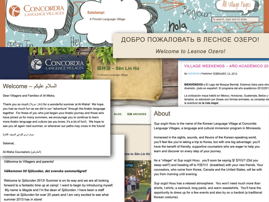
Only about 20-25% of the global population is estimated to speak English to some extent, and only a fraction of them may be proficient in reading and writing it. I’ve had the privilege of supporting users who may not fully understand English or are native speakers of other languages.
To address language barriers and respect cultural differences in content, I’ve taken the following steps:
- Ensured that databases use standard character encoding (e.g., UTF-8) to support characters and symbols from various languages.
- Implemented internationalization (i18n) and localization (L10n) practices to accommodate different languages, cultures, and regions, adapting content and design accordingly.
- Advocated for clear and straightforward language, benefiting both non-native speakers and individuals with cognitive disabilities.
Visual Clarity
Accessibility improvements often enhance the overall user experience for all users, not just those with disabilities. Clear and well-structured design can make content easier to read, navigate, and understand.
To support individuals in and from different areas of the globe and those with low or impaired vision, I’ve:
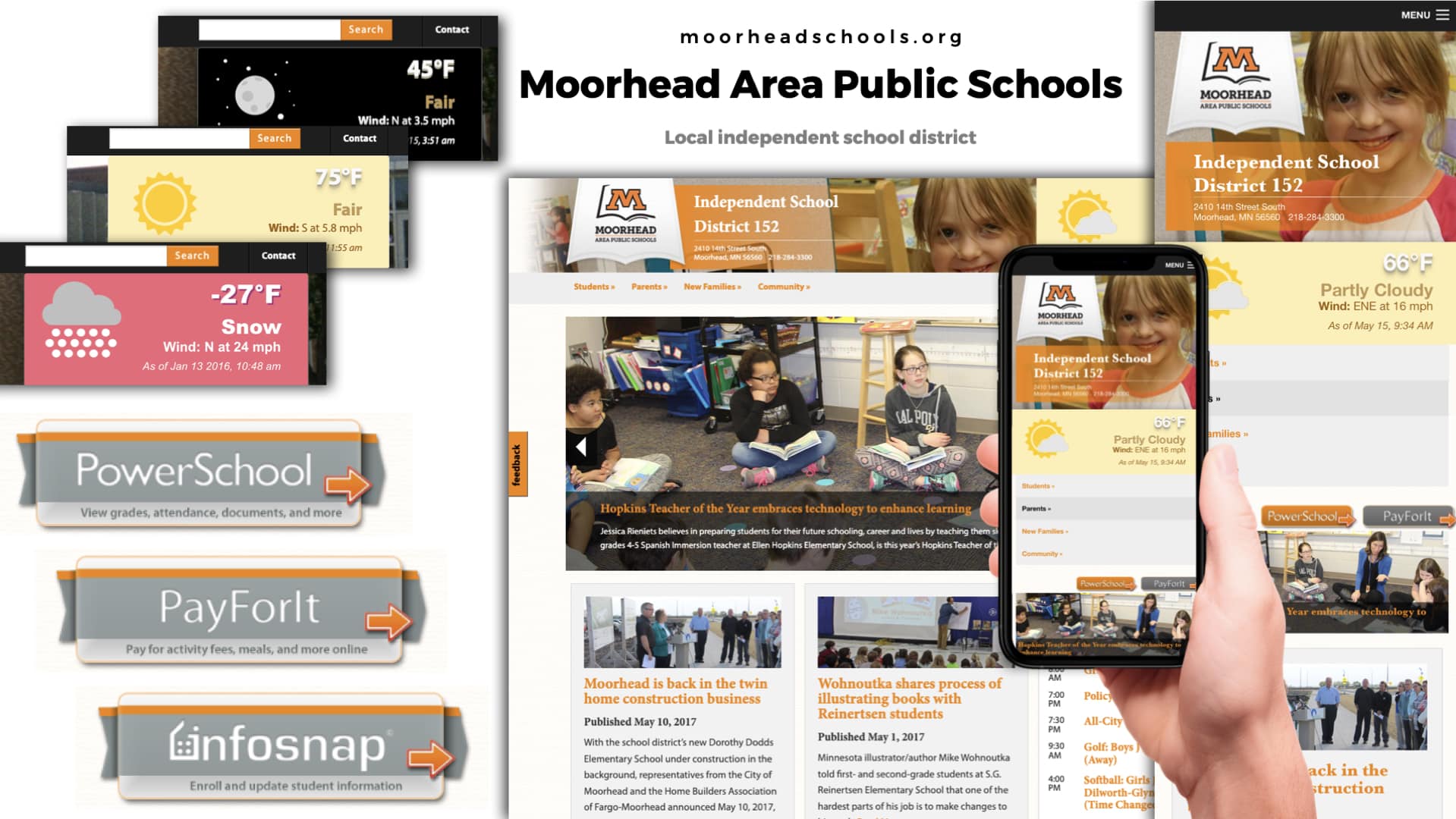
- Utilized responsive website design to ensure that sites adapt to different screen sizes and orientations, which is especially important for mobile users in diverse regions.
- Incorporated universally recognized icons and symbols for navigation and interaction to assist users who may not fully grasp the language.
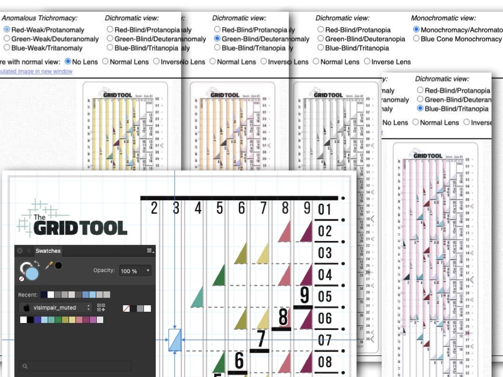
- Striven to ensure adequate contrast and color differentiation for individuals with visual impairments and/or color vision deficiencies.
Future-Proofing
Designing with accessibility in mind ensures the longevity of your online presence. As technology evolves, it becomes easier to adapt to new devices, screen sizes, and assistive technologies when you have a solid accessible foundation.
By following web accessibility guidelines like WCAG (Web Content Accessibility Guidelines), I have:
- Utilized alt text for images and provided transcripts and captions for multimedia content to facilitate comprehension for screen readers and non-native speakers.
- Ensured that keyboard navigation is intuitive and efficient for users who may not be using a mouse, particularly important for individuals with disabilities and those using non-Latin script keyboards.
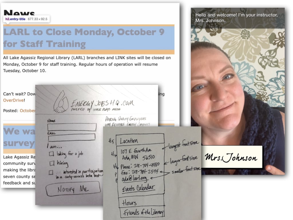
- Employed proper HTML markup for content structure, including heading tags, lists, and semantic elements, facilitating understanding for screen readers and search engines.
My commitment to accessible design has yielded tangible results in enhancing online experiences for diverse user groups. By prioritizing legibility, language inclusivity, visual clarity, and adherence to accessibility guidelines, I’ve contributed to improved user engagement, expanded audience reach, and ensured a future-proof online presence. These efforts underscore the transformative impact of accessible web design, emphasizing its significance in creating a more inclusive and user-friendly digital landscape.