How can we build on past experiences for better outcomes?
This case study underscores the iterative nature of product management by showcasing two redesign projects for one website. It also shows the value of ongoing improvements, adjustments, and refinements based on user feedback and changing requirements.
One Site, Two Redesigns
Overview
I led two website redesign projects for a local public library system that serves approximately 130,000 people in 7 counties at 24 locations and LINK sites. My efforts had a direct impact on significantly enhancing their online presence, which led to a subsequent website redesign engagement four years later.
My approaches involved restructuring information architecture, creating intuitive navigation, and simplifying complex information through data visualization techniques. By leveraging customized WordPress installations, we seamlessly integrated attractive designs with essential features such as event calendars, resource links, and location information. These updates not only garnered positive responses but also bolstered community engagement.
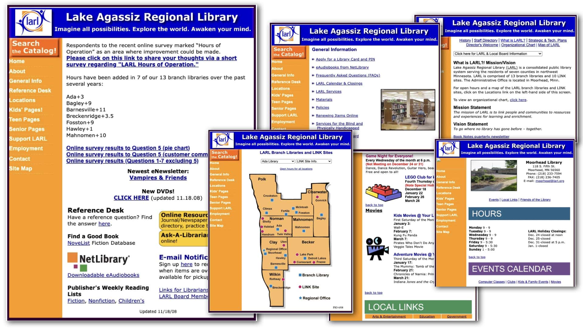
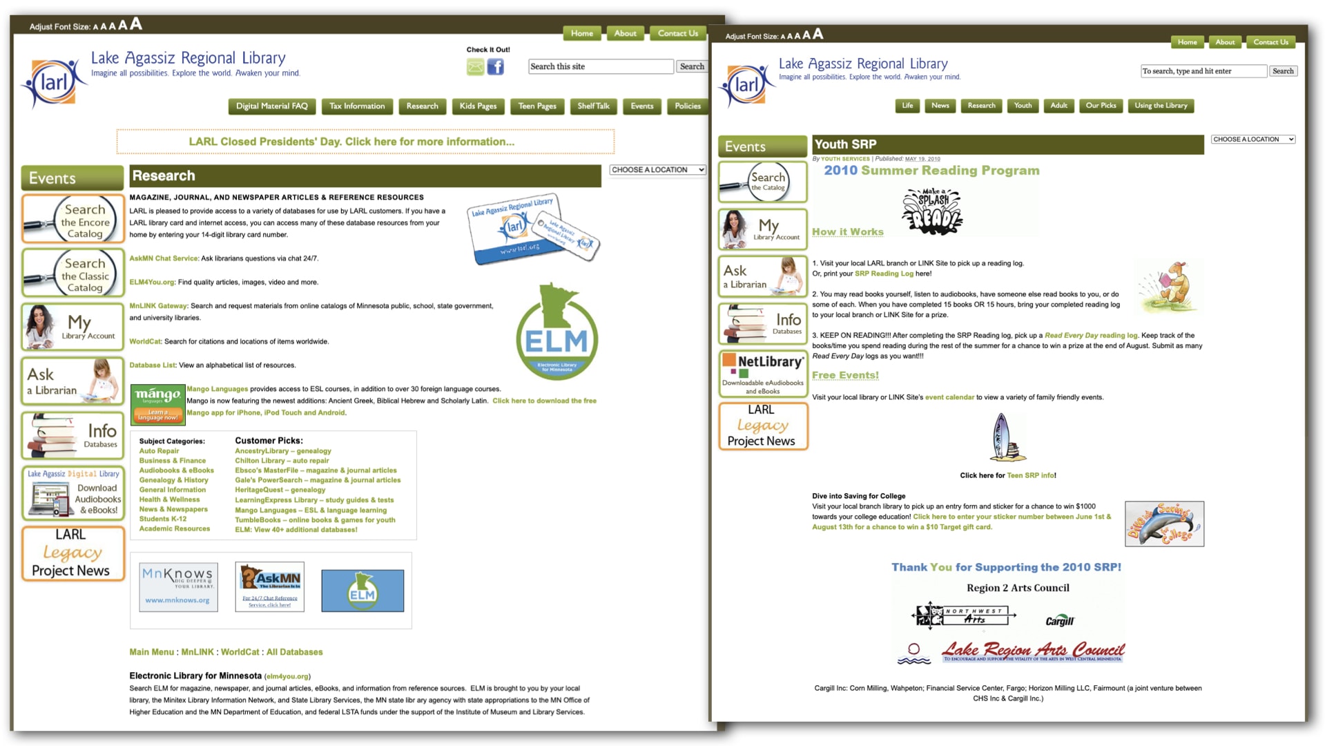
The Original Website
The library system’s online presence required enhancement to better serve its community. The need was to create a user-friendly, visually appealing platform that efficiently conveyed information and resources, thereby fostering greater engagement.
The library had several challenges that needed to be addressed with the first redesign, including:
- Limited Technical Resources: The library’s Network Administrator had limited time for web development due to his responsibilities maintaining on-site servers, the network, and computer hardware for staff and patrons.
- Bottlenecked Information Flow: The Marketing Director had become a bottleneck for online information since all 24 sites needed to send their updates to the main branch.
- Lack of Brand Consistency: The absence of a consistent brand or style guide led to inconsistency in the use of icons, images, and colors.
- Disorganized Content: Haphazard addition of information resulted in long, disorganized pages.
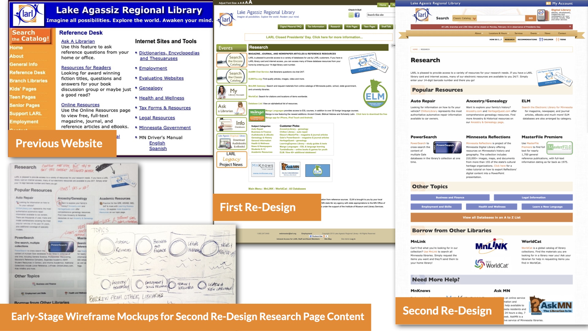
Furthermore, a lack of knowledge about web browser and mobile compatibility best practices was causing the site to quickly become outdated. For example, the image map was interactive, displaying branch site locations. But its main purpose, directing users to the respective branch webpages, failed on most devices.
What We Did
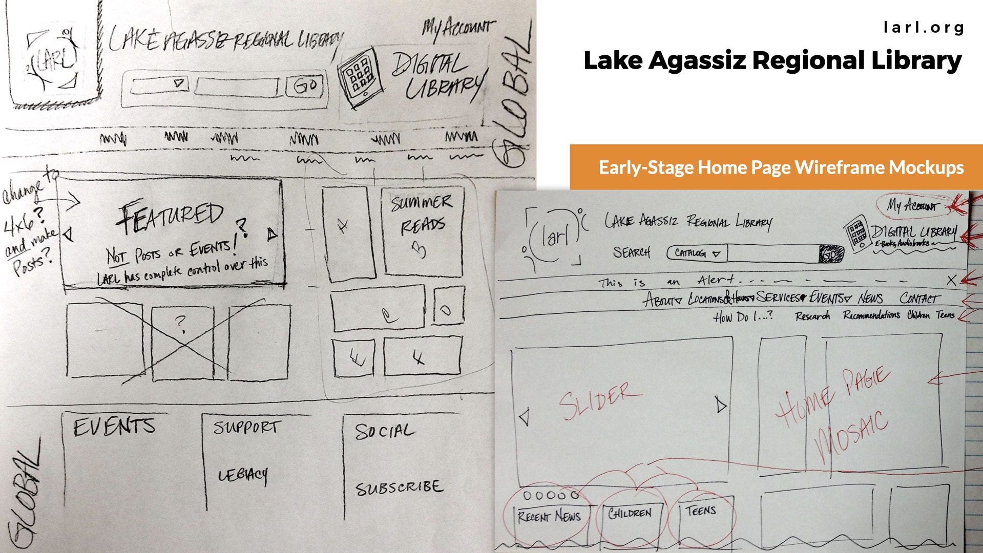
I planned and led both projects from initial discovery meetings to launch. While the Designers began re-envisioning the overall look and feel of the site, I performed meticulous information architecture restructuring to enhance the overall user experience and make the navigation more intuitive. I created cohesive categories and pages, emphasizing frequently sought-after information while encouraging users to explore more resources.
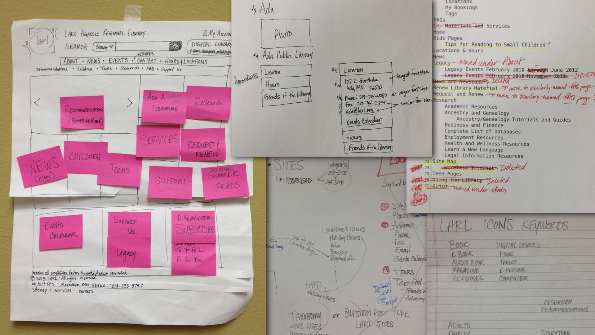
Flexibility and adaptability are critical in achieving effective product outcomes. My wireframes evolved as I collaborated with our in-house team and contacts at the library to hone-in on features and capabilities.
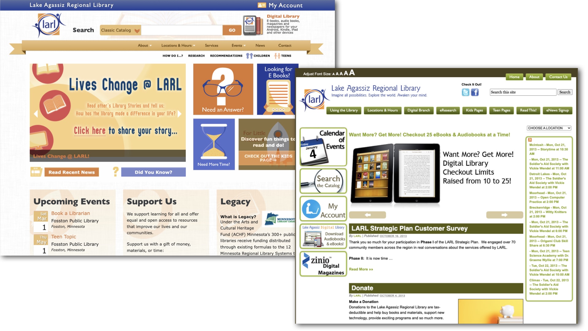
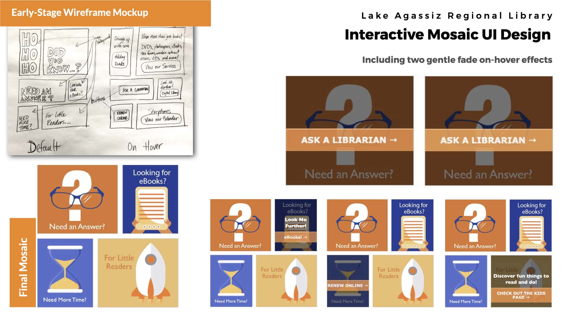
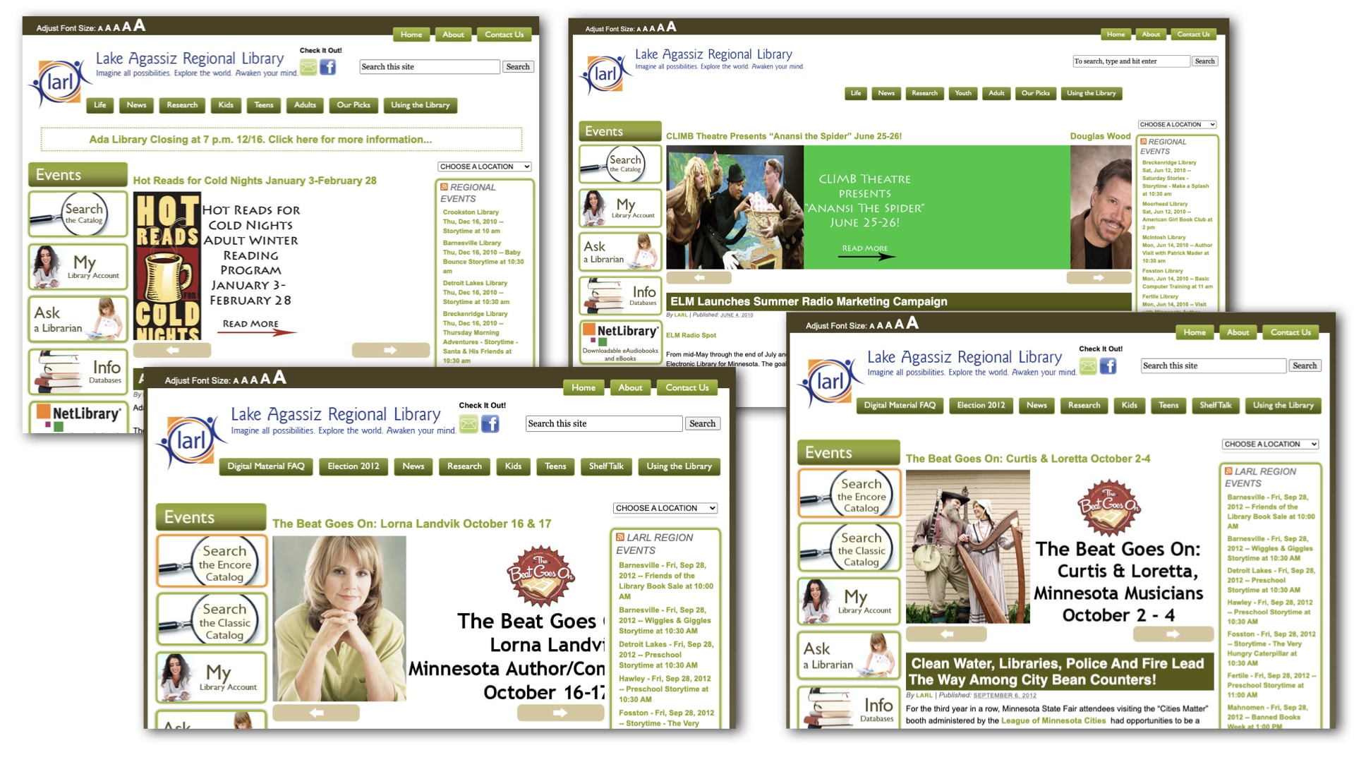
For instance, the design team envisioned an interactive mosaic of button links on the home page for the second re-design. We initially planned for this mosaic to display 6 links across all devices, prioritizing the most-utilized website features. However, during the planning phase, we reconsidered its physical space requirements, the effects that only worked with mouse actions, and the necessity to maintain a minimum text size.
As a result, we simplified it to 4 buttons, as the other links were already accessible through the navigation menu. Additionally, we decided to hide it on mobile devices. I collaborated with the designers, using their imagery as the foundation for the mosaic’s design. I handled the rest, including building the mosaic and its interactions, styling the buttons and text, and adding on-hover effects.
I also improved the organization of key pages. Take the Research page, for instance. After the initial redesign of the site’s layout, it remained cluttered with an overload of information, logos, and links. However, in the second redesign, I systematically categorized and wireframed the page content to create a user-friendly layout. This made it simpler for users to comprehend and access the resources they needed.
To expedite online information delivery, the initial redesign aimed to empower branch librarians with user-friendly website management features, including a conditional display “ticker-tape” alert, an events calendar, and an auto-scrolling featured blog post.
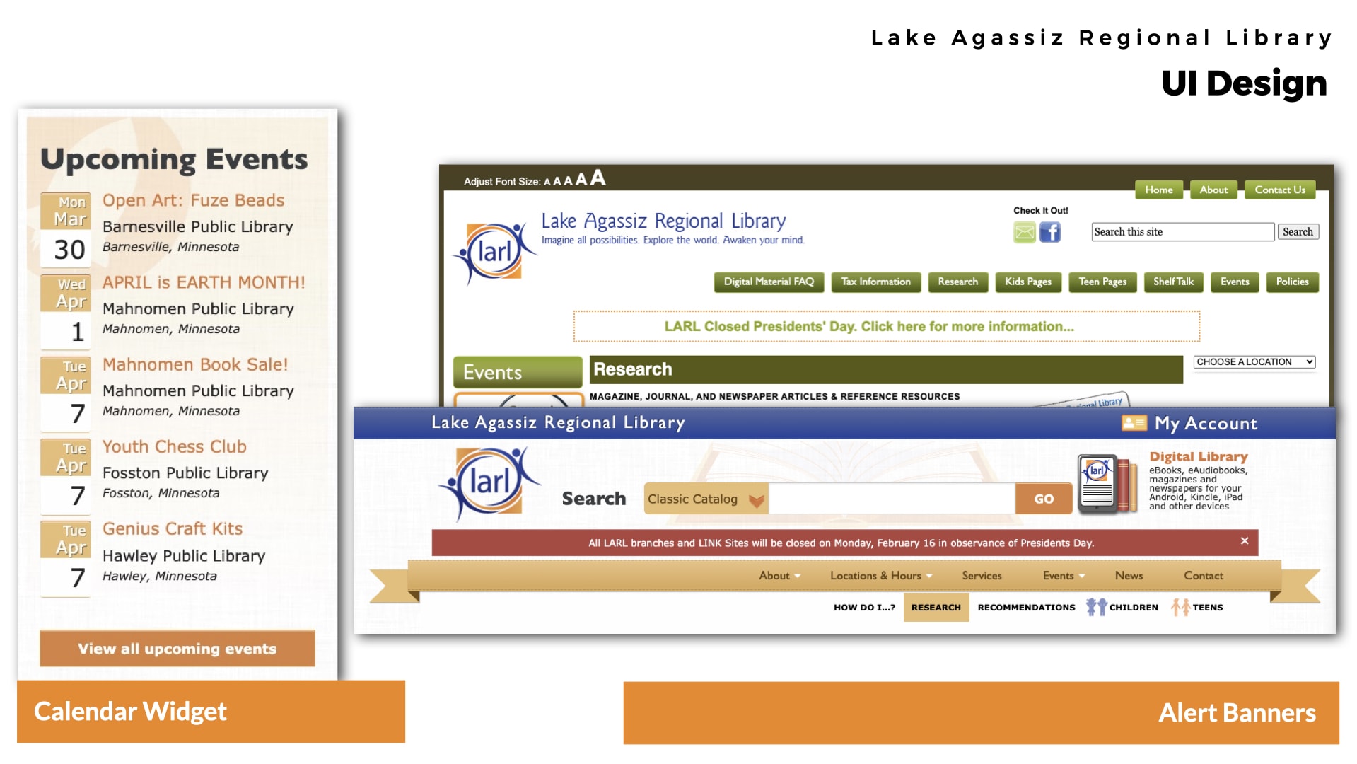
I also established profiles and configured permissions for multiple users. Because our objective was to enhance their control while providing style and color guidelines, I worked with the Marketing Director to choose which rich text editing options to offer vs. which were exclusively controlled by the site’s CSS. Then I created step-by-step documentation and trained library staff on how to manage User Accounts and the site’s pages, blog, calendar, and other features.
Overall, my role in this project involved:
- Custom WordPress Website Migration Project and Product Management
- UX and IA Structure
- Multi User Events Calendar, Blog, SEO Tools and HTML Email Setup
- Advanced Programming Integrations
- UI Graphic Design
- Front-End Programming
Results and Learnings
Both redesigns achieved transformative outcomes. The incorporation of customized WordPress installations and user-centric design facilitated seamless navigation, integration of essential features, and enhanced brand identity. Notably, the second redesign included new features like a catalog search bar, dynamic event highlights, and responsive design, contributing to a more user-centered library experience.
Some of our upgrades from the first to the second redesign were driven by technological advancements. In the initial redesign, we integrated a third-party calendar system that the library had purchased. However, due to limitations, we could only create off-site links to it. Additionally, there were few options for styling the off-site calendar, causing it to look distinctively different from the cohesive design we aimed for.
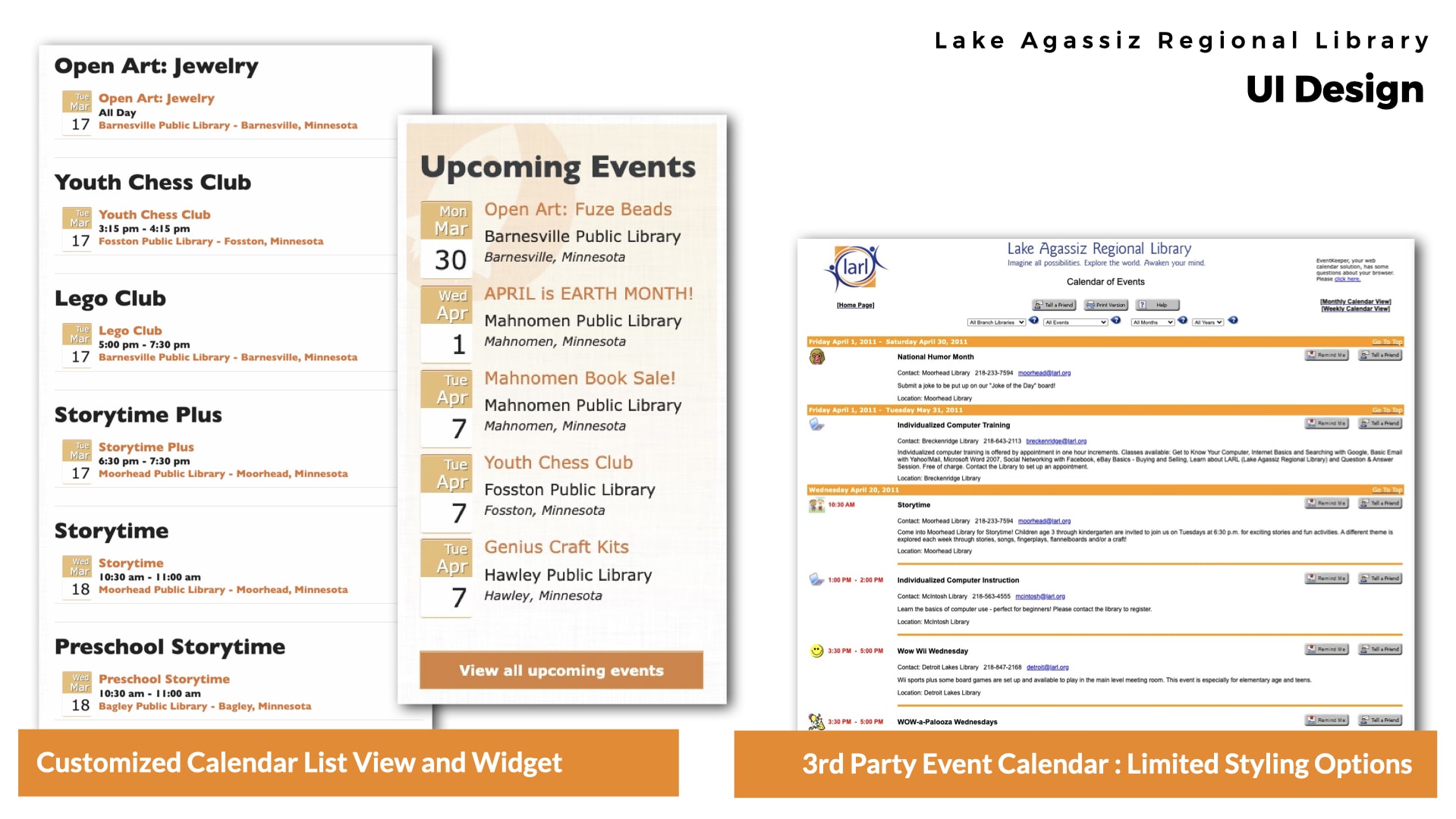
In the second redesign, I researched and installed a free plugin that offered a more advanced calendar system. This plugin gave us control over the design, allowing us to match it with the library’s brand. Additionally, we streamlined the login system’s integration with the website, making management more efficient. Users could now handle both the site and calendar with a single login, eliminating the need for separate logins.
Furthermore, I gained valuable insights into usability design between the first and second redesigns, which I applied to this project.
For instance, we realized that we had given branch librarians (and the Marketing Director) a significant amount of control in the first re-design. Despite having style and design guidelines in place, it turned out that this level of control was overwhelming. They struggled to keep their location’s information up-to-date and often misinterpreted the style guidelines, resulting in edits that deviated from the brand. What’s more, they frequently made changes to the information architecture and navigation, unaware that adding too many items to the navigation menus would disrupt the design on smaller screens.
As a result, in the second redesign, we decided to reduce their ability to manage the site, and most of those duties were reassigned to the Marketing Director. This experience taught me valuable lessons about assessing a client’s resource capabilities and how to propose solutions that are future-proofed.
Although we retained the slider gallery on the home page in the second re-design, I implemented a different type that offered better compatibility with mobile devices and evolving technology. In addition, I established clearer guidelines for the images that the Marketing Director should upload. To simplify the process, I created a template that allowed them to pre-format images to the correct dimensions before uploading. This combination of enhanced guidance and updated technology resulted in a more successful outcome for the library, with content that aligned more seamlessly with the design.
Our journey emphasized the need for continual refinement based on past experiences. By prioritizing user-centric design and collaboration, we met the library system’s needs and engaged the community effectively. These projects’ success underscores the value of iterative improvement and the long-term benefits of user-centered digital experiences.